Bless the University of North Carolina Charlotte. They have an entire department called The Charlotte Visualization Center in their college of computing and informatics that offers a doctoral program in computer science visualizations.
Data visualizations: they’re a thing, and they can be complicated
Do you know the difference between a Venn diagram and a Euler diagram? I’m betting not, and here’s a great diagram that shows you’re not alone.
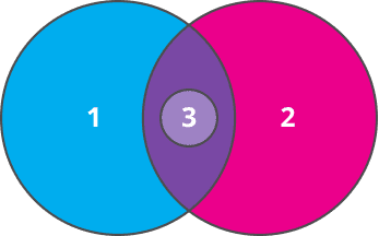 |
1. People who know what a Venn Diagram is. 2. People who know what an Euler Diagram is. 3. People who know the difference. Source: https://en.wikipedia.org/wiki/File:Euler-venn-example.png
|
I absolutely confess that until I read this Wikipedia article about the Euler diagram, I thought I was part of set one. As it turns out, however, I’m not even on the chart!
This article by (now Dr.) Drew Skau does a nice job explaining the difference between the two. He wrote it when he was a doctoral student at that wonderful center at UNC Charlotte. (I’m quite proud to share that he’s now a product manager at a technology company.)
What our newest data solution taught me about data visualization
If you’re wondering what took me down this pig trail in the first place, it was a conundrum we were having with diagrams in one of our brand-new reports, which is set to launch soon. (Truth: we thought they were Venns when they’re actually Eulers.)
It turns out that Venn/Euler diagrams are an imperfect science
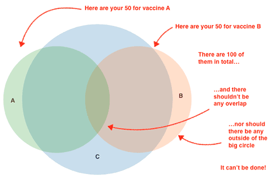
Here’s a basic example that describes the issue really well. Imagine you have a diagram that shows some of your patients are compliant for one vaccine (vaccine A) (spoiler alert for the topic of our newest report), some are compliant for another (vaccine B), and all are compliant for yet another (vaccine C). We’ll use 100, 50, and 50 to keep things simple.
Now, imagine that there’s no overlap in the compliance for vaccines A and B. In other words, no patients are compliant for both. Remember, though — they’re all compliant for vaccine C.
Create a visual of that data and you end up with the diagram below. Two small circles that are the same size and each exactly half the area of the large circle. How do you smush them together inside the large circle, without any overlap?
The answer is: you can’t.
What’s a scientist to do when the science doesn’t work?
As you can see, we have a problem. You simply can’t take two smaller circles, each the same size and each half the size of a larger circle, and smush them into the large circle together with no overlap.
In geometric terms, if the big circle has an area of 1, its diameter is about 1.128. If the two smaller circles each have an area of 0.5, their diameters are about 0.798. Take those two small diameters and add them together, and you get 1.596, which is bigger than the diameter of the big circle.
This strikes at the heart of the issue: [bctt tweet=”Venn and Euler diagrams are commonly drawn with proportional areas, not proportional diameters.”] And sometimes those two concepts don’t play nicely with each other.
The bottom line: any time the areas of the two smaller circles prohibit their diameters from fitting inside the larger circle—and there isn’t enough overlap to accommodate—the diagram will be mathematically impossible to create.
There are, of course, approximate solutions, and that’s what we’ll be using for our newest report. We’ll also have to do quite a bit of math to even calculate the scenarios in which we’ll have to use approximations. You can see our valiant senior data analyst, Will, working through the geometry below.

The formula on the board that he’s working with is this one…
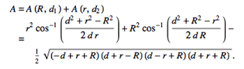
…which tells you the area of the overlapping part of the two circles in the diagram, relative to the radii of the two circles and the distance between their centers. Fun, huh?!
At VetSuccess, we’re very proud to be your go-to data visualization experts
And we’re committed to providing you with the best data visualizations out there. Although it sometimes means investing a surprising amount of brain power, statistics, and computer science to do it (even when a diagram’s simplicity suggests otherwise) — we’re good, because this is what we love to do. Simplifying the complex into something beautiful, meaningful, and actionable — to us, that’s magic, and there’s nothing we’d rather be doing than making magic for our clients!
Kevin Keystone is Head of Product for VetSuccess.